

Designing for someone who lives, works, and thrives in your own community is always a rewarding experience—but this recent brand project took that feeling to the next level. I had the pleasure of creating a full logo suite for a local realtor whose business is as warm and people-centered as the community she serves.
Her brand is unmistakably personal—built on years of success in real estate and fueled by a genuine passion for smart, authentic marketing. From our very first conversation, it was clear that this brand needed to capture both her professionalism and her heart. The result? A visual identity that feels grounded, welcoming, and quietly confident.
The Color Palette: Warmth Meets Strength
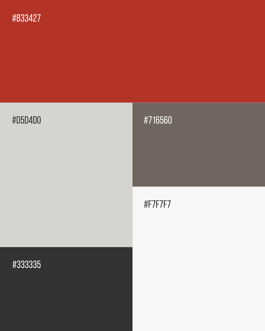
The brand colors are a thoughtful mix of rich reds, soft gray-tans, and deep charcoals. Together, they create a palette that’s both bold and inviting—evoking trust, warmth, and a sense of grounded professionalism. It’s the kind of palette that feels right at home in the real estate world, but still stands out with personality and purpose.
The Logo Suite: Designed for Flexibility & Meaning
We built a full logo suite that gives her the flexibility to show up consistently and beautifully across platforms—while staying true to her values and style.
-
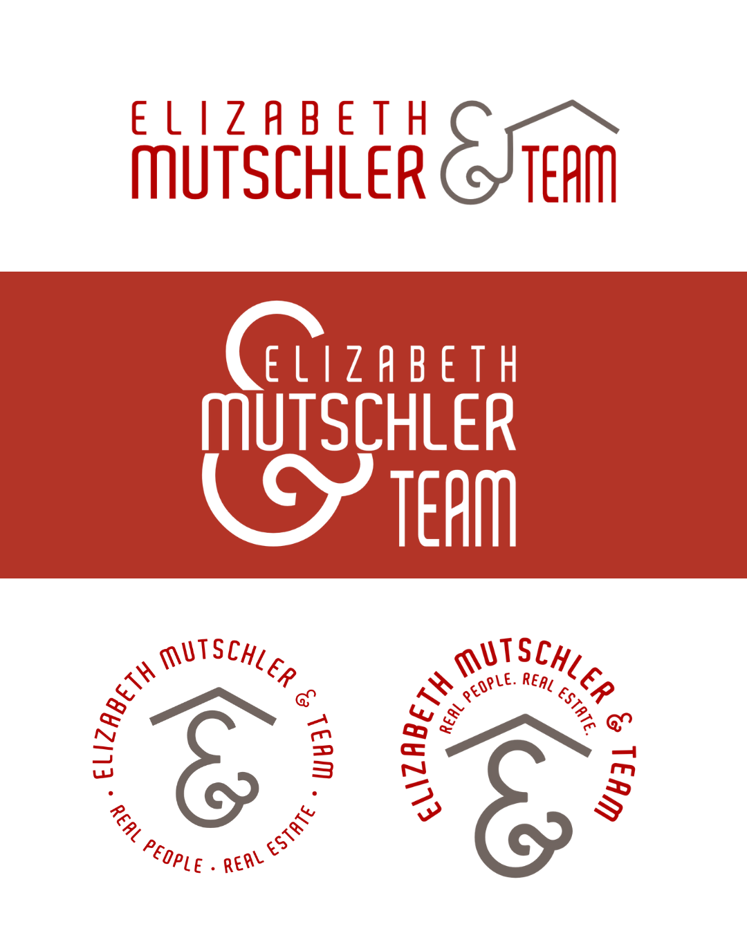
Primary Logo: A horizontal layout featuring a roofline detail that subtly symbolizes home and connection—two things at the core of her work.
-
Secondary Logo: A stacked variation that highlights a bold ampersand, tying the visual identity together while nodding to her personal love for the symbol. (The ampersand is a beautiful metaphor for connection, continuity, and relationships—all of which define her brand.)
-
Logo Marks: Two circular marks that include her tagline: real people. real estate. These are designed to be memorable, flexible, and instantly recognizable, whether used on signage, social media, or print.

A Brand That Feels Like Home
At its heart, this brand reflects someone who’s deeply invested in her work and her community. It’s a visual identity that says: “You’re in good hands.” It welcomes you in with warmth and assures you with strength. It’s a brand that feels like home—and that’s exactly what we set out to create.


Looking to build a brand rooted in your values?
Whether you're a small business owner or a service provider ready to level up, I'd love to help you bring your vision to life. Let’s create something that feels like you.