
A Realtor Brand That Truly Hits Home
Rooted in Community, Built on Heart
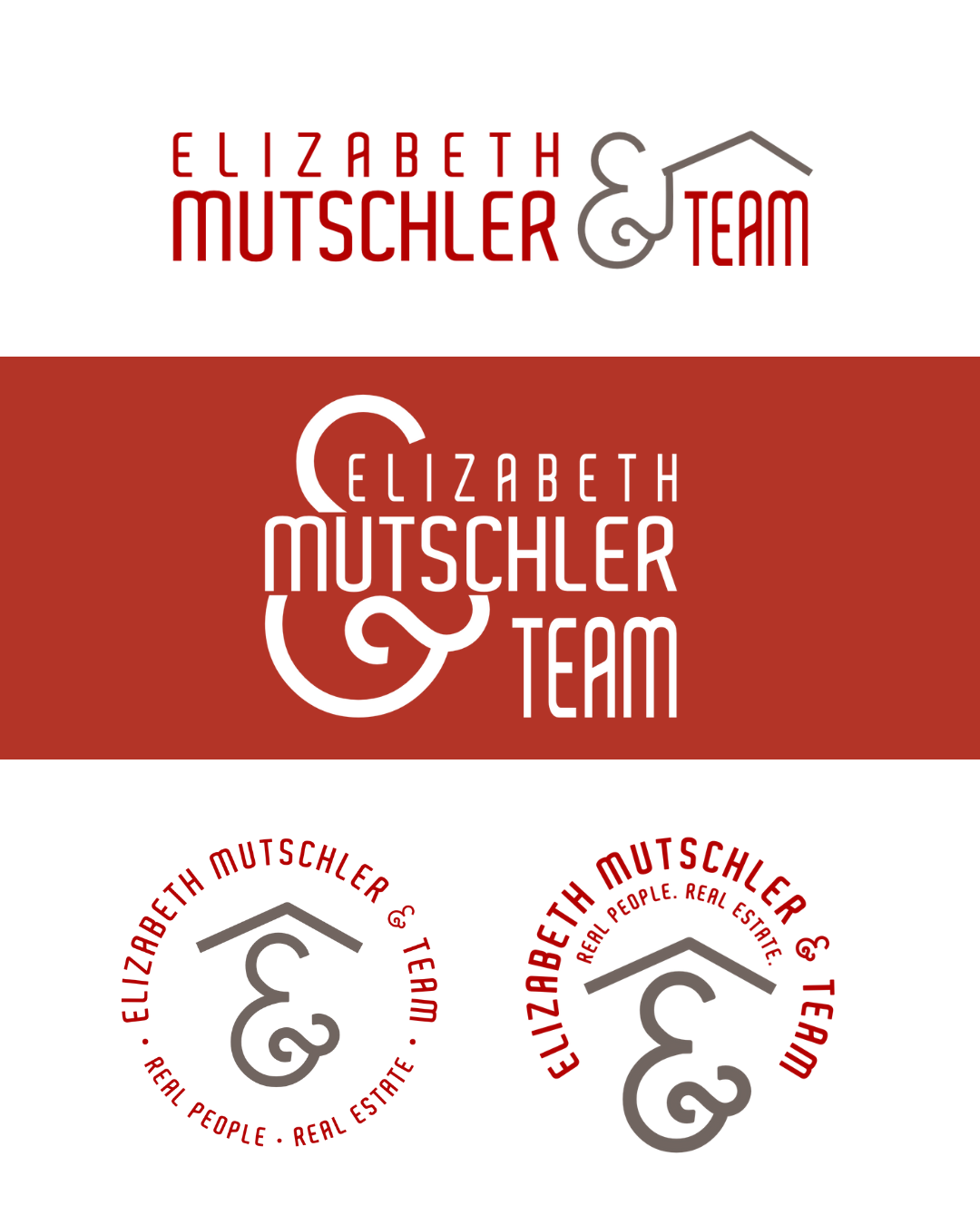
Designing for someone who lives, works, and thrives in your own community is always special—but this brand project for Elizabeth Mutschler & Team brought that connection full circle. I had the joy of crafting a complete logo suite for a local real estate expert whose business is as warm, welcoming, and people-focused as the neighborhoods she serves.


Branding That Reflects A Rare Balance
Years of proven success in real estate paired with a deep, genuine passion for authentic, strategic marketing. They're not just selling homes—they're building lasting relationships, offering guidance, and creating a sense of belonging for every client they serve.
From our very first conversation, it was clear that their brand needed to go beyond the typical realtor image. It had to capture both their polished professionalism and the warmth they bring to every interaction. We wanted something that felt elevated yet deeply personal—reflecting not just what they do, but how they do it. The result? A visual identity that’s grounded, approachable, and quietly confident—just like them. It’s a brand built to resonate with real people in real communities, while still standing strong in a competitive market.
Warmth Meets Strength
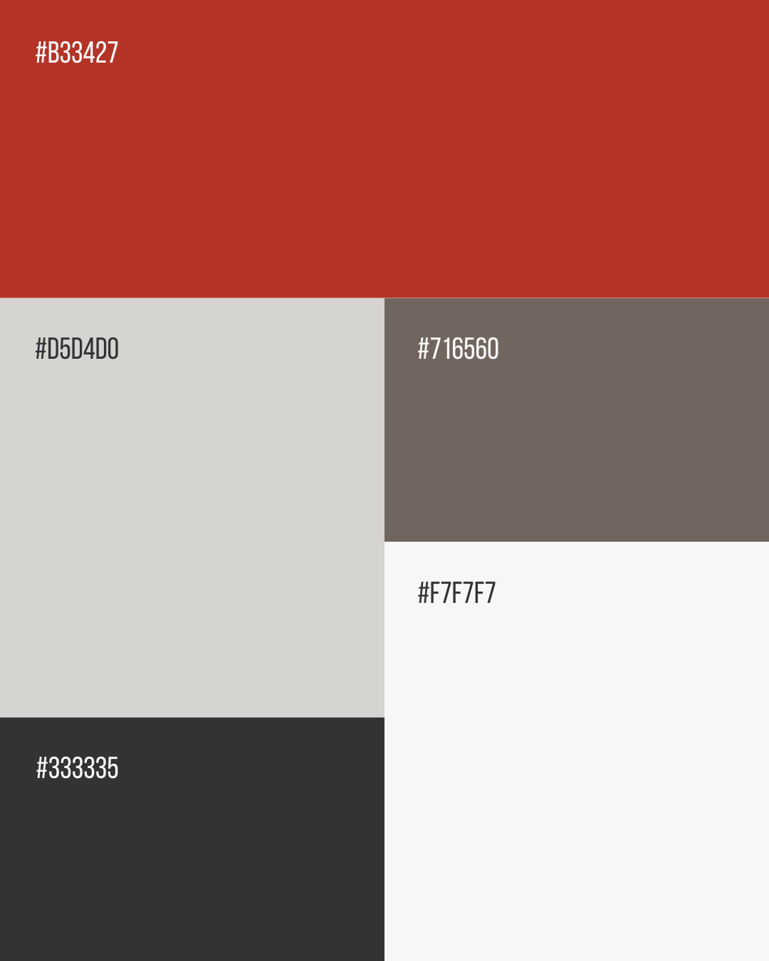
We combined rich reds, soft gray-tans, and deep charcoals to create a color story that’s bold yet comforting—striking just the right balance between personality and professionalism. The rich reds bring a sense of passion and energy, while the earthy tans and grounding charcoals offer a calm, reliable foundation. Together, these tones evoke feelings of trust, connection, and authenticity—everything you'd want in a real estate experience. It’s a palette that not only reflects Elizabeth Mutschler & Team's approachable nature and deep community ties but also helps her stand out in a crowded market with warmth, clarity, and purpose.


