
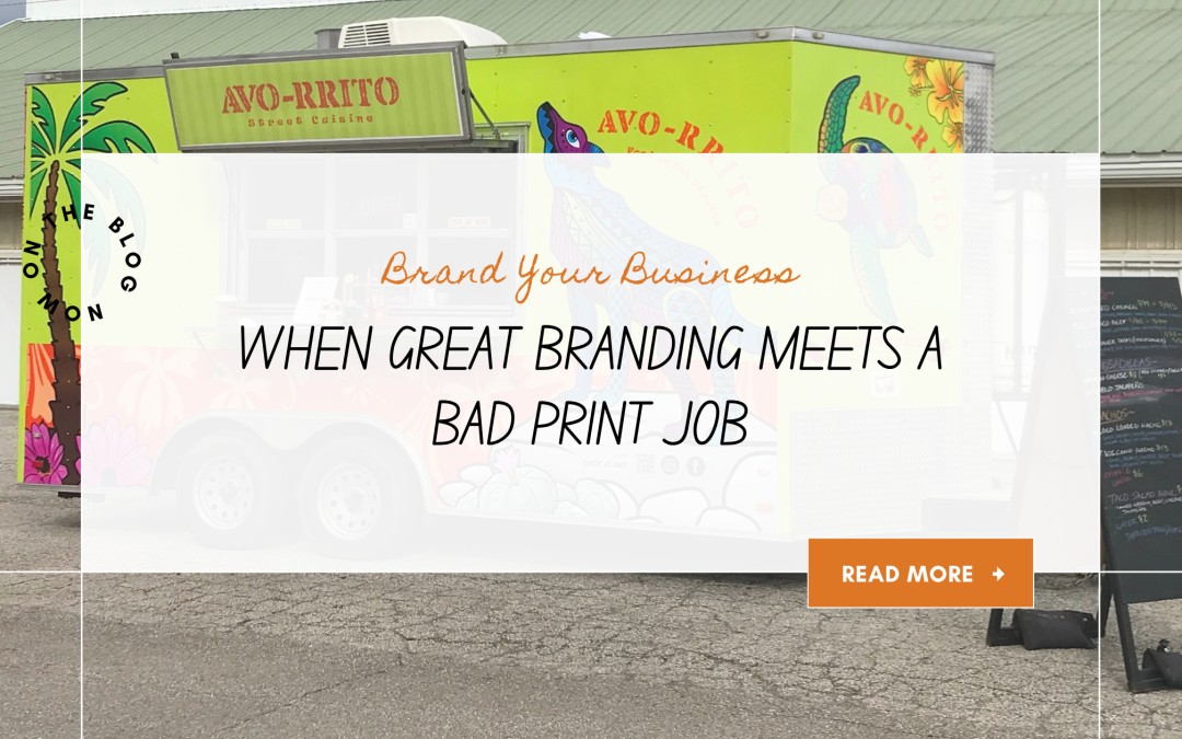
At the beginning of this year, my husband and I finally decided it was time to fully wrap his taco trailer and bring the entire brand vision for Avo-rrito to life.
For years, he had been operating with banners I designed, and while they worked, we knew the trailer had more potential. A full wrap would turn the trailer into a moving billboard, grabbing attention everywhere from neighborhood events to busy highways. From the back especially, people often had no idea what kind of business he was. More than once, he joked that the trailer blended in with lawn crews unless someone noticed the exhaust system on top.
Building a Brand That Actually Felt Authentic
We wanted something loud, colorful, and impossible to ignore. Something that felt like a rolling fiesta while still staying true to who he is and what his food represents.
His concept has never been the typical greasy food truck experience. He focuses on clean, whole ingredients with no freezers and no fryers. The menu attracts vegetarians, vegans, gluten-free customers, and people with food sensitivities, while also leaning into island-inspired flavors and seafood options. A huge piece of the inspiration came from his time living in Ventura, California, where he fell in love with Mexican street food culture and the laid-back coastal energy that surrounded it.
From a branding standpoint, we wanted the trailer to reflect all of that.
The Creative Direction Behind the Wrap
We started sketching ideas and building the visual direction. Since the name Avo-rrito is a play on “avocado,” I knew a fresh avocado illustration had to make an appearance. My husband also loves El Caminos, so naturally one found its way into the design too.
At the same time, we intentionally avoided overly common visual themes we see repeatedly in food truck branding. We stayed away from sugar skulls and anything that would make the brand feel like “authentic Mexican cuisine,” because that isn’t what he’s trying to be.
Instead, we leaned into the vibrant colors and spirit of alebrijes, the beautifully detailed Mexican folk-art creatures often seen as spirit animals. The result was something colorful, energetic, and completely unique to him.
In the end, we created a wrap design that felt cohesive and custom from every angle of the trailer.

Choosing the Printer
We were incredibly excited to send the files off to print.
After talking with a few local printers, we chose a company we felt confident would execute the project well. My husband was on a tight deadline because the trailer had been snowed in for weeks and he had upcoming events scheduled. The printer assured us they could make the timeline work.
As the designer, I submitted the files a week before production to make sure everything looked good on their end. The printer reviewed them and said everything looked great.
There was only one small moment that gave me pause.
He mentioned wanting the bleed area to be a solid color instead of allowing the artwork to naturally bleed off the page. He also didn’t specify an exact bleed size, which felt unusual, but we moved forward.
The Excitement Before the Reveal
A week later, we got the call that the trailer was ready.
We were thrilled.
When we first saw it inside the garage, the wrap looked exciting. Seeing the artwork scaled up that large was surreal. But once we brought it home and looked at it outdoors in natural light, the issues started revealing themselves one by one.
The First Red Flag: Missing Transparency Effects
To be fair, the print quality itself was good. Most people probably would not notice many of the problems unless they were specifically looking for them. But as the designer, and after the amount of time my husband and I spent refining every detail, the mistakes became impossible to ignore.
The first issue involved transparent elements in the background.
Across all four sides of the trailer, I had included ghosted versions of the logo and floral elements using transparency settings. Normally, if a printer cannot reproduce transparency correctly, they flag it immediately. Instead, no one contacted us. Even after the first panel printed incorrectly and the ghosted artwork disappeared entirely, production continued without a single mention of the problem.
That alone was frustrating.


When the Bleed Becomes the Problem
The bigger issue involved the bleed.
Because the printer requested a solid-color bleed instead of extending the artwork, random green stripes now appeared throughout different sections of the trailer where the panels ended. Some sides extended fully to the edges while others didn’t, creating inconsistent bands of green that interrupted the entire flow of the design.
Once you noticed them, your eye went straight to them every time.

Good fit all around.

Green stripe going down the right side.
The Propane Panel Disaster
Then came the side with the propane tanks.
Ironically, this was the simplest section of the trailer. I intentionally kept the design minimal because there was limited space. It only included propane warning information and the emergency shut-off label.
It should have been the easiest panel to install.
Instead, the printer installed it in three overlapping horizontal sections. This shifted the placement of the text and caused the emergency shut-off wording to be partially blocked by a power box. Looking at it, I genuinely could not understand how anyone involved thought it was acceptable to hand off to a client.

What This Experience Taught Me
What surprised me most is that this printer has been in business for years. We had even seen other trailers they completed that looked decent. Granted, those designs were far simpler and less detailed, but I still expected a much higher level of craftsmanship and attention to detail.
The entire experience became a reminder of something important that applies far beyond trailer wraps:
Even when you have strong branding and believe you’ve hired the right professionals, you still need to stay involved throughout the process.
Ask questions. Request progress photos. Check proofs carefully. Follow up during production instead of assuming everything is being handled correctly behind the scenes.
We were so excited to finally see the design at full scale that we overlooked several warning signs until the trailer was sitting in the open with every issue fully visible.
Final Thoughts
Despite the frustrations, I still love the design itself because it captures exactly who my husband is and what his business represents. And honestly, every project teaches you something.
This one just happened to teach us in 60 feet of vinyl.